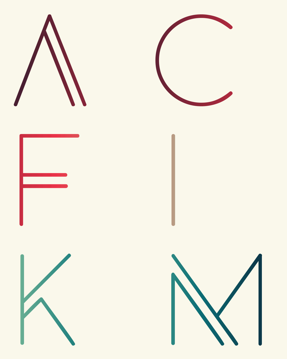
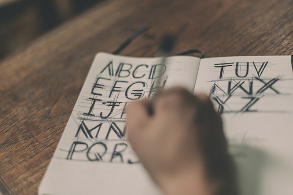
Image Slider

Showing posts with label design. Show all posts

Fun and Pretty Stationery from Etsy

| On
October 26, 2015
It's no secret that I absolutely love writing letters and with that comes a ridiculous love of pretty stationery and cards. Especially since I've moved far away from the majority of my friends and family, I've found myself going through so many cards, and so I've been on the hunt for some new ones!

As I'm sure many of you are, I'm a huge fan of Etsy because it's full of creative designs that you probably won't find anywhere else and you get to support people who are doing life their own way. I really respect that!

I put together a little collage of some of my favorites + linked to them below. Which are your favorites? Where else do you get cards and stationery? 


Left to right, top to bottom: 1 / 2 / 3 / 4 / 5 / 6


Any of y'all big letter writers? Aren't these adorable!! Don't worry--no sponsorships or affiliate links on these, just super cute cards.

Moodboard / Edgy + Feminine

| On
March 30, 2015
I'm unofficially making Mondays my day to collect and share inspiration. I've been doing that for a few weeks now, with the color palettes and affirmations and music and I think it's a great way to start off the week. It's also been a little while since I shared a moodboard just for fun, so I thought I'd make one for today! 

I first found this letter A and thought it was so gorgeous--how it looks like someone just splattered paint and it spontaneously formed a letter. That and the pink chiffon inspired me the most in this moodboard, but the more I worked on it, the more I absolutely love it! I tried to take the messiness of the letter A and the edge of the makeup and combine them with the softness of the pink colors. 


What do you think? What's been inspiring you lately? Don't forget to share Pinterest links with me!

Color Palette / Forest Explorer

| On
March 23, 2015
This color palette comes from a photo by the lovely instagrammer @ladycascades. I first saw this photo a month or two ago and it immediately made me think of my trip last summer traveling through the National Parks and Forests of California. Doesn't a photo like this make you want to go hike or sit under a tree for awhile?!

I could see this color palette being great for (naturally) any sort of outdoor goods company or goods from natural materials. These greens and browns give it such an earthy vibe!


Have you seen any gorgeous color pairings lately? Where?!

Color Palette / Antarctica Blues

| On
March 09, 2015
This photo is from one of my all-time favorite photography duos, Caroline and Jayde from Woodnote Photography. They do a lot of really interesting engagement and wedding shoots, but I really love following them on instagram for shots like this. Last year, they went to all seven continents. Can you believe that? I've just been aching to go to Antarctica ever since I saw these shots. 


Know of any other awesome photographers/instagrammers? Do share!

Instagram Inspiration 01.

| On
February 26, 2015
For the longest time, I've always considered Pinterest my #1 place online to find visual inspiration. I use tumblr a little bit here and there but it's really mostly been Pinterest. Lately (seriously--I'm really late on this one), I've been using Instagram as another place to find visual inspiration from photographers, stylists, and other artsy people. 

Today, I just thought I'd share a few of my favorite accounts. If you'd like, you can follow me too (@callmessafras)!

(@ourheiday)
(@velvetspectrum)
(@californiadonuts--yes, donuts inspire me)

(@thesaguarops)
(@happymundane)
(@jessicasays__)


What are your favorite instagram accounts?! Leave your username too so I can check you out!

Color Palette / Cotton Candy

| On
February 23, 2015
So this is an idea that I'm testing out as a new post idea--let me know what you think! I plan on this being an addition to current posts, not a replacement. I'll still have two (other) posts a week plus the curated on Friday, but I thought I could add this in once a week or so just to add a little variety. What do you think?

I use color palettes like this all the time, especially in my design work. When you find a picture that gives you the same feels you want out of a new website or piece of design, using the same colors gets you halfway there. Plus, aren't these colors just gorgeous to look at?


How do you like this new post idea? Yay/nay? How do you use color palettes?

Recent Design / Sprout Blog

| On
January 27, 2015
Hey y'all! So a little while ago, I started doing some design for other bloggers, here and there. Since then, I've worked with some awesome blogs + shops on creating an eye-opening brands for their passion projects. 

One of my favorite recent projects is this one, for a soon-coming blog called Sprout. Being a plant lover, I immediately loved the name. The woman behind the blog, Naomi, started gardening as a form of zen to deal with her stress-filled career. 

Sprout is a blog that follows not only her gardening but also her personal growth into holistic health and happiness. In the design, we were inspired by the concept of boldness, imagery of vegetables and gardening and loose brushstrokes. Needless to say, we really connected on this project!

Thank you Naomi for letting me help you build your new blog! 

Color Files: Flint

| On
January 06, 2015
While I have always been a huge fan of color, the older I get, the more I tend to dress in neutral colors. The majority of my closet these days is white, black, navy, grey or taupe. And while that sort of sounds boring at first, it's actually really freeing because everything matches and I can mix them in tons of different ways. Plus I feel kind of stylish and French chic. Or something like that.

Anyways, I thought grey deserved to be the color of choice for the revival of the color files series, specifically this medium grey, not light, not dark, that I'm calling flint grey.

Also, just a handy reminder--it's spelled grAy in America and grEy in Europe, or when you want it to look prettier, like I do. :)


Anyone else with me on the neutral-toned wardrobe thing? I especially love adding a small touch of color like these three accent colors above. 

Font Friday: Tesla

| On
August 29, 2014
I mentioned a little while ago, in my last edition of Font Friday, that I really like clean lines. I'm attracted to sans serif fonts, much more often than serif fonts. (Serifs are the little tails on letters--sans serif fonts do not have these. All fonts on my website are sans serif.) But what I really love, as a design enthusiast and font lover, is a font that can stand on its own. Once you have one of these fonts, it can be a logo on its own, without much additional design. 

This font, Tesla, from Lexi Griffiths on Behance, is one of those fonts. Inspired by circuits and electricity, this font would be perfect for the logo of a grunge band or a really cool underground coffee shop. Then again, most cool fonts could work for some kind of coffee shop. 


All images from Lexi Griffiths on Behance. Visit her portfolio to download the font.

Visual Inspiration #4 / Packaging

| On
August 20, 2014
Side note: my semi-regular series called "# Visually Inspiring Pins" has been renamed "Visual Inspiration" because often times, my inspiration comes from places other than Pinterest. :)

One of my favorite boards on Pinterest is my 'Packaging' board. When I'm out shopping, I know that I'm so much more likely to buy something if it's packaged well than I would have been otherwise. You know what I mean--those really cute cards at Target that you don't really need, but come on they're boxed up so pretty! 

I find it so interesting how we can be drawn to something simply because of the way it's presented. If you think about it, this is an idea that can be translated in every area of life. Do you want to be the delicious smelling coconut-hibiscus candle in a plain jar that no one ever smells? Or the brightly colored one that smells just as good? Sometimes, it really is just about getting people's attention.

Tea Packaging
mineral matches
package
#design #packaging
Soap Stones
Lotus Cold Process Soap - Handmade Soap - Phthalate Free - Soap Bar

1 / 2 / 3 / 4 / 5 / 6


Want more visual inspiration? Follow me on Pinterest or view more design inspiration posts.

Font Friday: Odin Rounded

| On
August 15, 2014
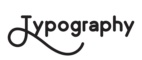
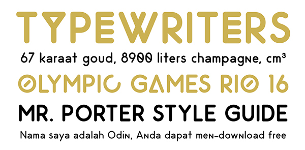
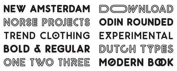
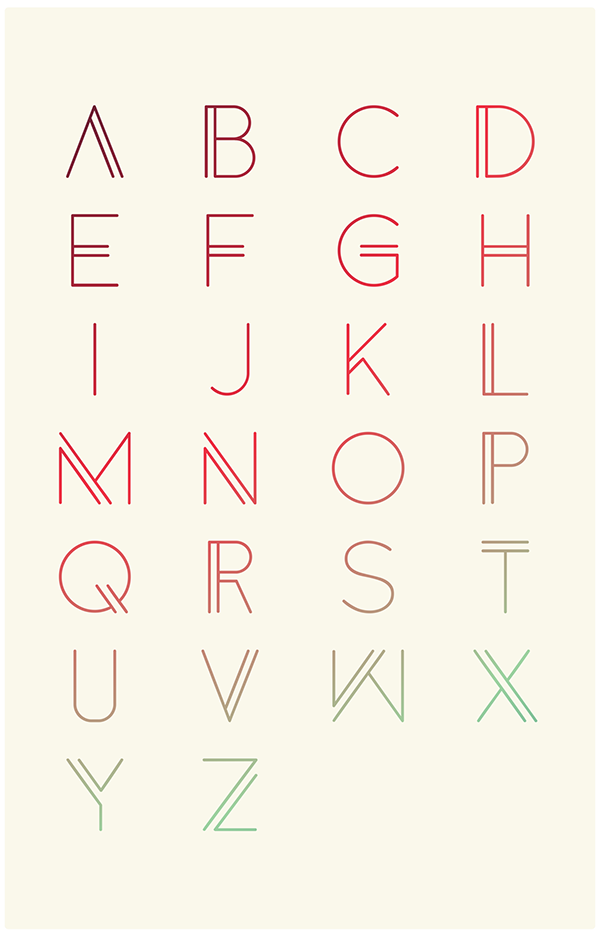
I love any font that is clean/legible, but still interesting and well designed. Odin Rounded is definitely one of those fonts. Scroll down a little + see--isn't that little cross hatch in the capital 'O' amazing?! Love it! This font would be great to make the logo of a funky/modern coffee shop or in some retro movie posters or something. 

Download for free from Frank Hemmekam's portfolio on Behance. All graphics by Frank Hemmekam.


What's your favorite font these days?

Free Font: Anders by Tom Anders Watkins

| On
August 01, 2014
I'm seriously digging this font. The lines, the clean, minimalist feel, the just-bold-enough uniqueness. This would make a killer header font for a rad fashion blogger or a tech website. 


Isn't it just awesome? And as always, best of all, it's totally free. All images are courtesy of Tom Anders Watkins on Behance. Download the font.

(Also, happy August!)

Color Files: Tangerine

| On
July 18, 2014
When I'm working on design for my blog or others, I'm constantly amazed by the way that color can transform lines. It can add a totally new attitude to a design or even make YOU feel things. Colors can hold memories and associations. I know whenever I see a certain shade of blue, it makes me thing of Lake Michigan. I bet you're the same--ever see a color and immediately think of your college's colors?

One of my favorite colors these days is tangerine. Tangerine can feel summery, clean, fun, fresh and invigorating. It can give energy, provide inspiration and wake you up. It feels lively and warm.

Crossbody bag / Roller Date Stamp / Swimsuit / Heels / Pillow / Bracelets - source not found


Anyone else obsessed with tangerine? How will you use tangerine--in your outfits, design or art?

DIY Design: Make a Font From Your Own Handwriting

| On
July 12, 2014
(photo)
Over the last few weeks, I've been adding my own hand-lettering to my blog, just here and there. Personally, I think it adds a fun, personal touch! But what if you don't want to (or don't have time to) hand-letter every graphic you need for your blog? Fake it!

A few days ago, I downloaded the InstaFontMaker app for my Android tablet (which is free in the Google Play store!), just to noodle around with it. It turns out, it's ridiculously easy to make a font out of your own handwriting! Just take your phone or tablet, open the app and write every letter as it prompts you. Then, you can email it to your computer where you can open and install it like any other font file! 

Just a few tips: I found it was easiest to use on my tablet as opposed to a phone. It gave me more space for my wrist and it was easier to get a big view of each letter. I also used a stylus (just a plain old $12 Targus from Target/Walmart) and I found it made a huge difference in neatening up each letter. 

Just for fun, you can download my handwriting font, which I've titled Swirl. Have fun! If you make your own, I'd love to see it!

4 Visually Inspiring Pins

| On
July 08, 2014
Early early this morning (read: before 5 am), I took H to the teeny-ten-gate airport near me and sent him off back to North Carolina. And though I know in my heart that I'm meant to be in Michigan for this season of my life and he's meant to be in NC, I'm still thoroughly pouting that he's gone. To cope, I'm trying to occupy myself and my mind with anything that I can do without thinking of him. So pretty much, I've settled on Netflix and Pinterest. 

Despite my mood, I'm still (as always) gravitating towards bright, lively greens and yellows. It just feels like summer!


Something about these colors never fails to cheer me up just a little bit. Leave your Pinterest URL so I can follow you! Follow me here.


Desktop Wallpaper: Yosemite View

| On
July 01, 2014

GUYS I'M SO EXCITED. H is coming to visit tomorrow! And it's only been two weeks since I've seen him so that's not really a huge deal, but I'm really excited to show him around the town where I grow up and work and live for part of the year. It's one of those places that I know inside and out and it's so dear to my heart. And naturally, H is so dear to my heart and I just need him to meet my town.

I've actually gotten sort of obsessive about it--I've already made a detailed itinerary for what we're going to be doing for the next five days--cherry picking, pizza at my favorite place, bike riding, visiting the state park, going to the beach, walking in the 4th of July Parade, going to the Tabernacle (church) with my family, etc. It's a big deal! So already, I can tell that July is just going to be swell.

But June was pretty great too! Among the highlights, I graduated, went to California and settled in Michigan for the summer. Tomorrow I'll recap June a little more thoroughly, but today I just want to share one little bit of my California trip (since apparently I'm never going to get through all my pictures).

The natural beauty in CA was just gorgeous and this was one of my favorite spots in Yosemite. I know it's not a particularly creative shot but guys. It was impossible to take an ugly picture.

Even more than just the view, I love the story behind how these mountains came about--through rivers and glaciers freezing and melting over thousands of years. What a great reminder that good things really do take time. 

To download, just click through on the picture and save the full-size photo which is linked. Then set it as your desktop background!

Enjoy the wallpaper and the rest of your Tuesday!

10 Resources for Free Fonts

| On
June 27, 2014
Fonts make me so happy. Honestly, finding a good quality font just makes my heart wiggle with joy. And getting fonts for free is even better! I'm a super stingy person sometimes, I'll admit, and I hate paying for things if I don't have to. So I rarely buy any fonts (with the exception of anything Emily Lime. Homegirl's got it going on.). 

So I decided to do y'all a huge, magnificent favor (you're welcome) and share my secrets for finding the best, high-quality free fonts. 

#1: DaFont.

Okay, not a secret. And I'll admit, there are a lot of really crappy fonts that you won't ever EVER need, unless you're having a Western themed quincenera in Las Vegas. But Dafont still is probably the largest site for exclusively free fonts that I know of and the category options on top make it (sort of) easy to sort through. They also have a really great collection of dingbats, which are fun to practice your PS clipping masks on. My favorites: Alpaca (sans serif), Geo Sans Light (my 2nd fave sans serif in the world), Trees TFB (a dingbat font of, you guessed it, trees).

#2: Behance.

Behance is largely paid design, but has a decent collection of free font families or a free weight or two to try out a font. These fonts are generally clean but unique so they'd make a great header. As a matter of fact, the main font in my header is from Behance. Isn't it fun? My faves: Simplifica (tall sans serif), Odin Rounded, and just for fun, Infinity Space Icons.

#3: Dribbble.

Again, largely paid, but a simple google search offers a list of fonts tagged as free. Lots of talented designers develop fonts here and then offer a couple weights for free. My favorites: Uni Sans, Anke Sans and Composition.

#4: FontSquirrel.

They call themselves the "Free Font Utopia" and I just might agree. My favorite part about Font Squirrel is that all of their (free!) fonts are also free for commercial use! This is especially helpful for all y'all designers so you don't have to worry about buying extra licensing. Plus, they have a thorough tagging system that makes it easy to find what you need. Yay! My favorites: Sophia Pro, Grand Hotel, and League Script.

#5-10: Random Places!

Individual designers' portfolios or collections often offer extra free font options. Here are a couple I like:

Where do you find free fonts?

Custom Post Signature

Custom Post  Signature